BrideGuide was conceptualized by co-founders Natalie Stone and Danielle Calderone during a time when they both struggled with the complications and stress of planning their own weddings. They experienced firsthand how difficult it was to get the wedding party, friends, and family aligned due to the number of popular platforms of communication—text message, Facebook, Twitter, phone, and email. They wanted to create a social, fun, and easy way for brides to collaborate with their core group of friends and family members. They understood clearly that weddings are a time for celebration, and no participant wanted to lose focus or be bogged down by communication issues.
Upon meeting the clients, our design team learned that Natalie would be on her honeymoon in France for the majority of our project. This created the challenge of aligning both clients for presentation and feedback while working under an already tight time constraint. In addition to the fast-paced time frame, the clients had a limited budget for us to keep in mind while making our design choices.
The clients had a strong vision for their brand, but didn’t know how to visually execute it.They wanted it to be feminine but not girly, fun, sophisticated and modern; they wanted it to appeal to all brides. They felt that pink was the most appropriate color choice and wanted an overwhelmingly soft color palette with subdued grays.
We explored a variety of products to get a better sense of the style directions to take.

Column A: Wedding planning apps
Column B: Checklist or messaging apps
Column C: Sites with a brand-appropriate look and feel

Wedding Wire operates online marketplaces for the wedding industry. The saturated teal color felt off-brand and lacked personalization. Different sections with inconsistent iconography cheapened the look.

The Knot is a popular wedding planner app due to it's variety of features such as a to-do list, ideas, tips, a budget calculator, and lookbook. The combination of light blue and illustrated doves made it look off-brand; it was reminiscent of a baby shower instead of a wedding. The white space and simple line icons were successful in looking clean and modern.

WeddingHappy is a simple wedding planning app that builds a customized to-do list. The main dark color and monochromatic background were unwelcoming and off-brand. The colorful clipart icons made it look outdated. The content looked a little crowded on the screen.

LadyMarry is a wedding app for on-the-go DIY wedding planning. The use of multiple colors on one screen and the saturated pink gave it an unsophisticated look. The combination of lists and tabs were successful in organizing the content in a clear and concise manner.
Takeaway: It was important to use simple and consistent icon styles to convey modernity and sophistication. None of these in-category apps were successful in using a color palette that the clients envisioned for their product. The Knot came the closest, with its opacity, but it wasn't the desired hue.

Asana is a web and mobile application designed to help teams track their work. They used an interactive card layout and ample amounts of white space for clear organization of content.

Wunderlist is a to-do list and task management app. It organized content well with a combination of cards, lists, and negative space. The simple line iconography looked modern.

Messenger is an app for text conversations with friends on the Facebook social network. The group categories were organized well and the user profile pictures added personalization and familiarity.
Takeaway: We decided to use the familiar tab pattern from Facebook to organize the messaging section of the app. It was essential to use plenty of white space with card or list items for the task management section.

Dallas Shaw is a website for lifestyle illustration and custom design direction. They used a soft color palette of pinks with a black accent for a classy aesthetic.

Riley & Grey is a wedding website template application. From the variety of designs, this particular template best captured the brand direction for BrideGuide. The template used soft pinks, a light pattern overlay, and serif fonts for an elegant feel.

BHLDN is an Anthropologie site for wedding attire and accessories. They used a soft color palette with blush pinks and a combination of serif and sans serif fonts for a delicate appeal.
Takeaway: The soft pink was feminine enough and we found its use was brand-appropriate for BrideGuide.
After getting a sense of the clients’ goals and conducting our visual analysis of competitors we put our heads together to create the following three design principles:
BrideGuide will keep the bridal party involved and accountable without tension. Content should be scannable, which makes it easier for them to stay up-to-date and help when needed. Each bridal party member will feel better prepared for the bride’s big day.
Utilize white space for readability so that any text-heavy content won’t overwhelm users. Higher priority tasks should be made visible through clear visual hierarchy.

A wedding is a personal event and every bride is unique. BrideGuide needs to be versatile by allowing the bride to connect to the planning process and make the experience her own.
Simple wedding imagery along with user submitted photos are essential for personalization.

Connecting with one another should be an enjoyable and fun experience. There is a camaraderie that forms between wedding party participants. While not always physically together, those involved will still be linked in mind and spirit.
Rounded speech bubbles, emojis and heart icons will promote friendliness, direct involvement, and communicate tone and feeling.
Armed with our design principles and takeaways from the visual competitive analysis we set about creating three style tiles to conceptualize our ideas and open a discussion with the client at the next presentation.
We began to look over the UX team’s wireframes to determine which UI elements to incorporate in our style tiles. We formulated questions for the team and areas we wanted specifications on when the clients notified us they wanted to use screens they initially designed for their Marvel prototype instead. We had to switch focus to discuss specific aspects about the Marvel screens. Danielle and Natalie were not designers so they were unaware of certain best practices.


Feminine. I used a soft color palette with blush and pink. I used illustrations and avoided showing faces for a theme that didn’t feel too personalized. I combined the fonts Didot and Museo Sans for an elegant yet modern look.

Luxurious. For the second style tile I wanted to explore a slightly different palette so I introduced gold. I used Hind Siliguri and San Francisco because these fonts were developed for use in interface design and were therefore very clean and readable.

Modern. I used a combination of gray, blue, and pink with a lot of white space for a clean and modern look. I used silhouetted wedding imagery to avoid over-personalization. The font Hero was used in the header for its thin and modern, geometric lines. Century Gothic was the geometric font used in the body copy.
We shared our design principles and style tiles with Danielle. She was very enthusiastic about the principles and felt they aligned directly with their brand. She liked the idea of the overlay pattern from my first tile, but suggested trying it with a marble background instead of damask. We had a detailed conversation about the use of pink: it fit the brand, but to appeal to all brides we didn’t want to overdue it. Danielle mentioned apps that used different colors in each header bar and felt that could be a solution to this challenge. Our creative director warned it was difficult to use different colors and still have the design feel cohesive, so I was excited to tackle this task. The clients didn’t have a logo yet so we were given the option to create one or omit it from the mockups.
For our first round of testing we picked six screens that were key to the functionality of the app and utilized a variety of design patterns. We tested with brides-to-be and wedding party members. We asked them to list adjectives that came to mind while viewing the screens and comment on elements that caught their attention. I tested specifically for:

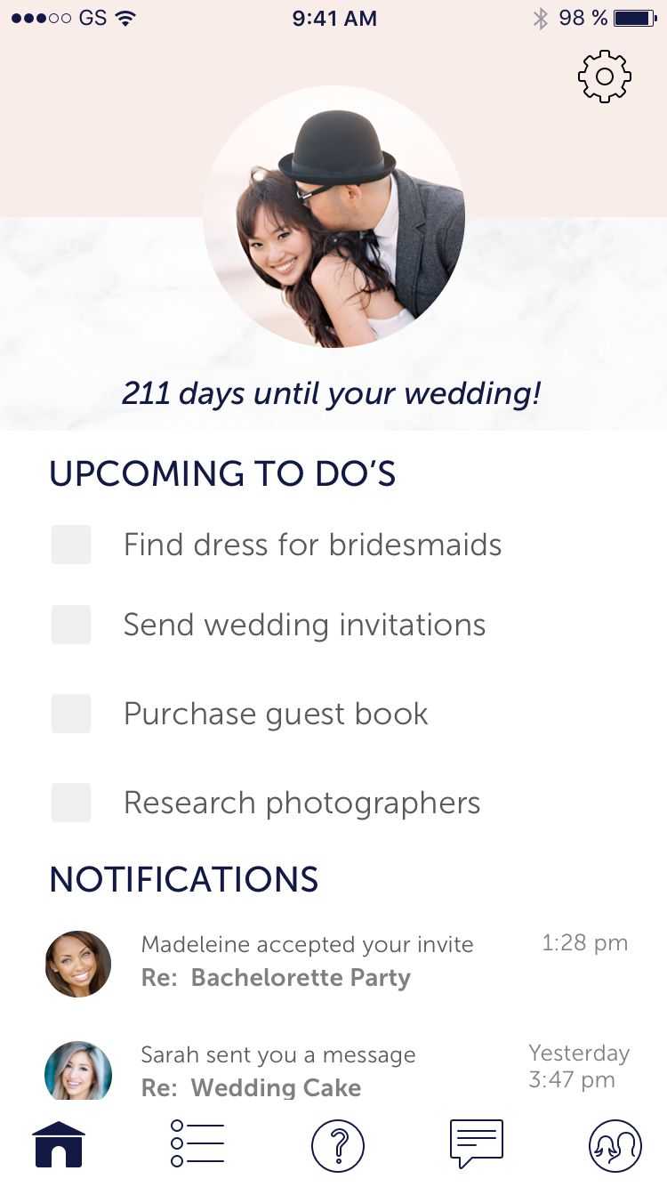


We tested with two brides-to-be, two bridesmaids, and a mother-of-the-bride. They responded that the screens looked clean, modern, and sophisticated. There was mixed feedback about the diamond icon as a logo—mostly positive, but it was also seen as a commercialized symbol and didn’t speak to the brand; it was better suited to a jewelry store than a wedding party. There was confusion surrounding the survey icon; a question mark was more symbolic of an info or help section. The dashboard looked crowded with both the checklist and the notifications section. The colored headers tested well; one user didn’t notice the color change and the rest said they liked the difference. The users all preferred checkboxes in the checklist section; it felt overwhelming and taxing to only have arrows to continually expand the list items.
I made alterations to existing screens based on feedback from the first round of testing and built out the app further:


I replaced the diamond icon with an illustrated flower bouquet and used the colors from the headers to color the flowers. The marble background tested positively on the first screens, but I felt it looked overwhelming to include it on the content-heavy screens; I replaced the background with a light gray color that was a blend of the lightest and darkest gray marble swirls. I replaced the survey and checklist icons with different images and replaced the midnight blue with gray and the call-to-action pink. Although I didn’t receive negative feedback on the color of the icons, I thought they looked a little harsh so I tested a softer palette to blend better with the rest of the design.
From these screens I created a clickable prototype to bring to the next round of testers:
PrototypeNatalie sent an email from overseas that there had been a miscommunication and two of the user tests she set up would be unable to fulfill their commitment. She also gave some feedback on our designs, but it was too late in the game to make any changes. Luckily, most of her touch points aligned with changes we had already made from our first round of testing.
We tested three brides-to-be; one in person and two remotely through video conferencing. One tester said the design followed a very standard convention: she said it reminded her of products from her iPhone. All of the testers voiced positivity to the clinking champagne glass animation on the success screen. The flower bouquet on the splash screen was better received than the diamond logo. One tester commented that she liked how the colors from the headers were incorporated in the flowers of the bouquet. The testers unanimously loved the photos in the contacts and messaging sections; they added personalization. One user mentioned the similarity between the checklist and survey icons, but understood the dilemma and thought I resolved it the best way possible.
This project presented the unique challenge of creating a design with wide appeal for a stylized industry. With two clients, their vision mostly aligned, but we sometimes had to interpret each piece of their feedback and determine a compromising solution. It was interesting to design from wireframes that had not already been through several rounds of UX testing. It forced us to analyze our design decisions more cautiously and test for feedback on functionality as well as look and feel. Luckily, I had previous experience arranging notifications, contacts, and messaging in an app called Raise The Woof.